TL;DR
- Google Ads are one of the best ways to get started advertising online.
- The first step to creating winning ads is to choose your keywords wisely, researching more than just how much they will cost you.
- What a Google Ad is made from and why you need to create copy that will appeal directly to your customer.
- Advertising online isn’t just about your ads. It’s about taking people to a landing page that builds trust and helps convert your visitors into customers.
If you have a website for your business, online advertising is the perfect way to boost your sales.
And the best part? It’s easily accessible.
No matter the size of your business or how long it’s been running, there are plenty of ways to advertise online without breaking the bank.
But there’s a lot of guides and blog posts about it on the Internet which can be confusing. And that brings us nicely onto today’s question…
“Dear Adzooma,
I’ve run a business for selling materials for trades and home DIY projects and want to advertise my stock online.
I want to take care of this myself, but some of the guides are a little out of my depth. What I need is someone to just explain to me, in very simple terms, the best way to get started and what I need to focus on first.
The rest, I’m sure, will come in time. I just need step 1.
So, Katherine, how do I get started with online ads?
Thanks“
Richard
You’ve come to the right place, Richard.
Before we get stuck in, we need to give you a word of warning. (We’d love to keep it all sunshine and puppy dogs, but sadly, the internet can be tough and harsh sometimes.)
Before you go galloping off into the distance, know there’s no single ‘online advertising’ solution to your business. There are different ways of getting your business in front of new customers, which will have their own unique advantages and disadvantages.
For example, if you’re looking to tell as many new customers about your business as possible – social media advertising might be what you need.
But generally, if you’re looking to get started, Google Ads is the best place you can begin.
Why?
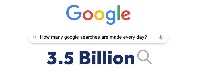
Just think about the sheer popularity of Google. Every day, over 3.5 billion Google searches are made.
That’s a ridiculous amount. But it shows that whenever a customer wants something, that’s where they’ll turn to. It’s what they use to find restaurants, businesses or presents for their loved ones.
Google Ads is how you target a customer at the exact time they’re searching for businesses like yours. Which means you can get more traffic from higher quality leads that are more likely to convert.
Don’t worry, it’s quick and easy to get started. There are just 3 simple things you need to do to create high-earning campaigns.

1. Choose Your Keywords
Keywords are the building blocks of online advertising.
They are the words or phrases you use to describe your ad. So, if you are running a campaign to advertise your bakery products, you might use keywords like:
- Cakes
- Cupcakes
- Custom cakes
If someone searches something containing your keyword, your ad makes a bid to show up in front of them. This means that your keywords play a key role in making sure your adverts are seen by the right audience.
But don’t be intimidated. You don’t need a marketing degree to choose them.
In fact, you just need to follow these two steps:
- Think about your customers. Your keywords need to be relevant to your ads and audience. Also, consider the actual terms your customers will be searching to find your ad. So, don’t just target generic keywords like “horses”. Instead, try more specific keywords like “horses for sale” or “horses near me”.
- Research your keywords! Use tools like SEMRush’s Keyword Magic Tool to see if people are searching for those keywords and how much your bids are likely to cost you. Don’t get too caught up though. Higher search volumes aren’t always a good thing and can mean a higher cost and more competition for you to beat.
Once your campaigns are live, you can use your data to really perfect your keywords.
2. Create Your Ads
Once you’ve got your keywords, there’s nothing stopping you from making your adverts.
They are simpler than you think.
Your standard advert is made up of the following things:
- Headlines. You can have 3 headlines, up to 30 characters each.
- Website URL. This is the webpage that your visitors will be sent to when they click on your advert.
- Description. You can have 2 descriptions of up to 90 characters.
That’s it.
Worried about the character count? Don’t sweat it, you’ll become great at writing short and snappy sentences in no time at all.
The secret to writing great Google Ads is to create engaging, benefit-driven and targeted adverts that really convince your customers to click.
It’s no use just telling you. Let’s show you an example advert for a florist:

This first example won’t get you many clicks.
Don’t get us wrong, the information it’s saying isn’t technically wrong. But, it’s too vague. It’s trying to appeal to everyone at once and burying a key benefit of free delivery right at the bottom.
Instead, compare it to this example:

It’s more targeted and snappier. It knows exactly who it’s appealing to – and talks directly to them. It’s putting its benefits front and centre so you know exactly why users will want to click.
Don’t get it right the first time?
One of the best things about Google Ads is that you can constantly change and test new adverts.
You’re never going to be limited by one advert. Run several and test them against each other.
Don’t stop there. Keep testing and looking at your data. That’s how you get kickass ads that make you money.
Want to know more about different ad types? Read our article on responsive search ads and, for a more fun take, our special Pokemon-themed Google Ads guide.
3. Build A Targeted Landing Page
Once your users have clicked your ads, they need somewhere to go.
This is called your landing page. It should be easy to remember, as it’s the page of your website that your visitors land on.
Landing pages are where you need to turn your visitors into customers or leads. This is called a conversion.
Sadly, conversions don’t happen by magic. People don’t just land on your website and then suddenly decide to buy or get in touch.
They need something that gives them the information they want and encourages them to take action. This is what your landing page is there for.
Want to harness the power of your landing pages?
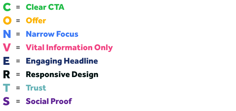
There are a few fundamental elements you need to create a landing page that converts. To make it easier, we’ve put them into a pretty neat word for you:
CONVERTS
It should be pretty easy to remember as it’s the goal you want to achieve! Wow. It’s almost like that was done on purpose.
Anyway, here’s what it stands for:

C – Clear CTA
Whether you want your visitors to add an item to a card, ring your company or fill in a form, there’s a specific action that you need them to take.
Your CTA (Call To Action) is the thing that encourages them to do it.
It should be direct, to the point, and snappy.
Struggling for inspiration? Use these as examples:
- Get your free quote today
- Book your expert fitting
- Order now for free shipping!
- Start your free month
O – Offer
Holy smokes, you have an amazing discount for new customers? You provide free delivery? You’ll give a tote bag out with any order?
If you’ve got an offer, no matter what it is, make it loud and clear.
They’re a powerful motivator and something that should never be hidden.

N – Narrow Focus
Don’t try and include everything into your landing page. Instead, make sure your page only focused on a specific product or service that you offer – relevant to the ad you’ve created.
A famous jam jar experiment once proved that having more choice doesn’t make people more likely to buy. In fact, it actually lowers your conversions.
Why?
Because more choice means more work for your customer’s brain. The more they have to think and the less likely they are to buy.
So, keep it simple and your focus narrow.
Don’t worry, you can easily create different pages for the other services you offer.
V – Vital Information Only
Don’t waffle on about things that aren’t important.
Boil the information on your page down to what really matters. And no, sorry, this probably won’t include how your business was founded.
Not sure what that is? Think about your customers. Everyone who visits your website will be asking the same, core question:
What’s in it for me?
Your landing page needs to answer that question. If it doesn’t, it needs to go. Simple.
E – Engaging Headline
The headline is one of the most important parts of your landing page.
It’s what draws people in. It’s what encourages them to read on. It’s the sweet little taster that really gets your visitors hungry for more.
Don’t just take it from us though. It’s something that’s been said over and over again. In fact, here’s a pretty good quote from advertising legend David Ogilvy:
“Headlines get five times the readership of the body copy. If your headline doesn’t sell, you have wasted your money. Your headline should promise a benefit, or deliver news, or offer a service, or tell a significant story, or recognize a problem, or quote a satisfied customer.”
R – Responsive Design
Responsive web design is essential for any modern website.
Why? Because not everyone will view your landing page on the same device.
You never know if your customers are going to visit your website from a computer, mobile or tablet. So, you need to account for all of them.
Responsive design is how you do this, as it automatically resizes your website depending on the device people to view it on.
With a responsive design, you have confidence that your website will always look its best to every user.

T – Trust
A landing page is designed to do one thing: encourage people to take action.
To do that you need to do two things:
- Convince your visitors that they want or need your product
- Reassure them that they can trust you
So how do you build customer trust?
Through guarantees. Through accreditation. Through reviews.
Offer a 30-day free trial? Do you have a 5-year guarantee? Do you have any industry-specific qualifications? Are you listed on CheckATrade? Did you win any awards for your product?
Tell your users about them and give them a reason why they can be confident buying from you.
S – Social Proof
FOMO (Fear Of Missing Out) is a powerful thing.
No one wants to be left behind and be the only one left out. So much so that it will actually drive a lot of visitors to take action just so they’re not left out.
You build this fear with social proof.
This includes using testimonials and reviews from real customers. Because nothing says you’re missing out than proof that dozens of people are already enjoying your product…
Social proof isn’t just about creating a FOMO. It’s also about building trust.
After all, nothing proves that your company and product is trustworthy than proof from other real-life people.
It’s why we have them on our own website.

If you still need a helping hand creating your landing pages, here are some of our favourite tools you can use:
One more thing…
You also need to make sure your landing page offers a good UX. This basically means ensuring it’s easy to understand and use.
It’s fundamental for every website. After all, if people can’t understand how to use it, they won’t. End of story.
Hopefully, this gives you the tools you need to get advertising online in no time.
All the best,
Katherine


