Landing pages remain a crucial part of customer acquisition. Anyone who says they’re overrated is either doing it wrong themselves or guiding you in the wrong direction.
They are designed to convert visitors into customers. From the moment someone lands on your page, they should be able to imagine the way your product or service will fit into their lives. The right techniques will also convince them to complete your desired goal – which can be anything from downloading your brochure to buying a product.
To help you do this, we’ve put together 6 top tips and our recommendations for the best online resources. If you want to scale your business even faster, our brand new Marketplace is the solution you need.
What is a landing page?
A landing page is a webpage that users are directed to when they click on a link, usually from a search engine results page (SERP), an email marketing campaign, or a PPC advert.
Read: 15 of the most inspiring landing pages
Landing pages shouldn’t be your home page. Instead, they should act as digital billboards for the service or product you’re selling. They save your users time searching your website for the information they need, making them more likely to convert. That’s why they’re also called lead capture pages.
The content you link from isn’t usually enough to convert customers on their own, so your landing page is your chance at convincing them to complete your desired goal. If your page isn’t effective enough, the time and effort put into your content or PPC ads will go to waste.
Imagine you’re explaining a service to your grandparents – you’ve finally got them to listen but their attention span is short. The things you’d tell them first? Put them in the first half of your landing page. Everything else can come afterwards.
Why are landing pages so important?
Landing pages capture leads.
If a user clicks through but isn’t 100% convinced, your landing page will either make them convert or make them leave. Their action of leaving before they move onto another page is calculated using a metric called bounce rate, and the best landing pages tend to have low bounce rates.
They’re also an excellent way to capture information about potential customers if your landing page is a web form. For example, you might want to increase the number of eBook downloads and a form allows you to build a list of contacts to use for retargeting and email campaigns later.
You can also use this data to find out the type of customers interacting with your business and improve your landing page experience. Here are some related stats:
- In 1997, Jakob Nielson of the Nielsen Norman Group found that 79% of people scan web pages.
- In 2008, Nielson did a similar study using eye-tracking data and found, on average, less than 20% of web page text content is read.
- In 2013, online publication Slate asked a traffic analysis firm called Chartbeat to analyse how site visitors engaged with its site content and others. They found that most visitors scroll through about 50-60% of an article page before leaving.
While all industry benchmarks are different, a high percentage of your customers might also refuse to give more than just their email address. Your landing page, along with CRO tools, can help you find out.
An effective landing page should also keep visitors on the page for longer and build trust in your brand. There are several techniques that can help you do this, such as creating engaging copy, optimising for mobile, and using captivating imagery and video.
What makes a good landing page?
There are several must-haves for your landing page to be a success. I’ve picked 6 to consider.
1. Write engaging copy
Users want benefits, not features.
If you offer free worldwide delivery, tell them. If your photo frames are handcrafted with the finest wood, make that crystal-clear. They don’t want to know whether you used Gorilla Glue or a Phillips screwdriver if it doesn’t benefit them in any way.
Visitors become customers when you convince them how much better, more relaxed, and stress-free your business will make them feel. And it all starts with your headline.
5x as many people read the headline than the body copy. If your headline is weak, the rest of your page will go unnoticed. Your headline needs to catch your reader’s attention instantly, as data shows you only have approximately 10-15 seconds to make a good impression.
You also want to include specific numbers and data to show credibility. Been a qualified makeup artist for 12 years, with 4.5 years experience in bridal? Say it exactly how it is – without rounding up.
2. Optimise for mobile
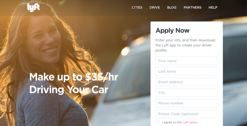
Your landing page must be mobile-friendly otherwise you risk alienating countless users that find on their mobile devices. From an SEO perspective, Google uses mobile-first indexing meaning it mostly uses the mobile version of a page for indexing and ranking.
Rather than try and stumble their way through a site that doesn’t work properly, visitors will go somewhere else. Your bounce rate we spoke about earlier? That will fly through the roof.
According to digital marketing firm CXL, you want to aim for a load time under 3 seconds. Anything over that and you should improve it. Over 10 seconds and you’re losing a lot of money. Why is this so important? Because 53% of mobile users abandon sites that take over 3 seconds to load.
As well as having a good page speed, both your images and text need to be correctly formatted. That means alt text for images and making sure text is large enough for people to read. Accessibility is often overlooked on the web but you’re discriminating against potential customers by ignoring it.
Google also reported that 48% of mobile website visitors who visit a website that isn’t mobile-friendly thought the establishment just didn’t care about their business, so having a responsive page has never been more important.
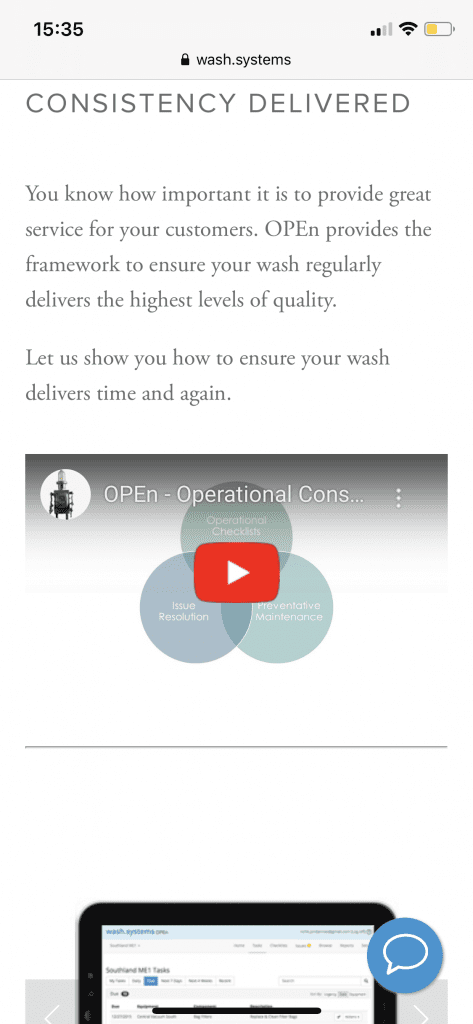
3. Include imagery and video
A landing page without images isn’t engaging.
People don’t come to your page to read paragraphs of text. They come because they want to find out why your product or service is better than anyone else’s. If they can see the benefits you’re describing, they will be more interested and likely to buy.
Some more stats on the subject:
- An article by Forbes stated that 91% of consumers actually prefer interactive and visual content over traditional, text-based or static media
- An EyeView study showed videos on landing pages can improve conversions by 86%
- Our brains process images 60,000 times faster than text, meaning these are the areas likely to be seen first
Users want to be entertained, so if you can use media to make your website look more appealing at the same time, site visitors are more likely to convert.
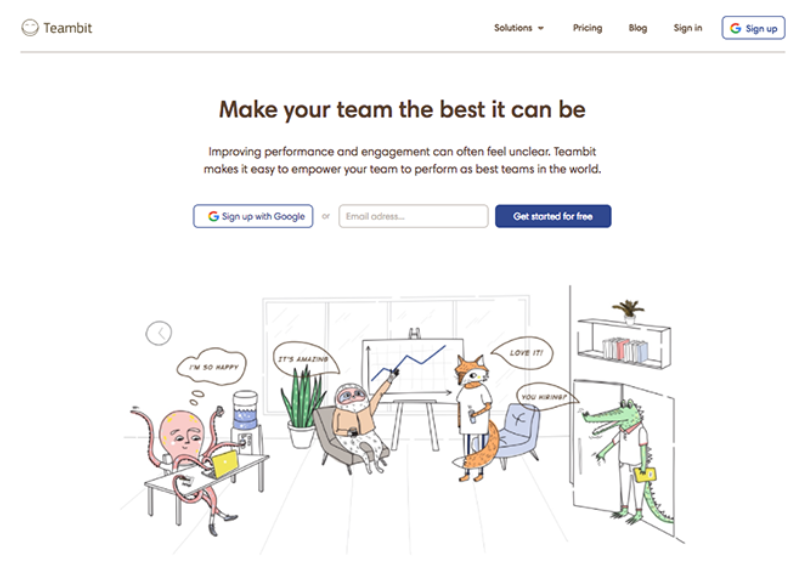
4. Emphasise positive testimonials
Testimonials help to establish trust and credibility within your brand and assure customers they’ll always receive an unbeatable service from you. Just a few lines could be the push they need to convert, as data shows 72% of customers don’t take action until they have read reviews.
A Podium survey states that online reviews have an impact on purchasing decisions for 93% of consumers. That means out of every 1,000 people visiting your landing page, 930 of them could be swayed by positive testimonials.
Include as many positive testimonials as you can, but cherry-pick the ones that say the most about your business. The ones that comment on your excellent customer service, your beautifully-packaged products, or how quick your delivery is will show that your business is worth buying from.
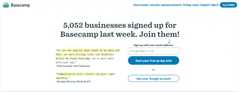
5. Create kickass CTA’s
Having at least one call to action (CTA) is crucial. There’s no point in telling your users how amazing your business is if you aren’t going to tell them how to take the next action – signing up for a trial, making a purchase, giving you a call.
It’s good practice to put your CTA in the first half of your page, in other words “above the fold”, so it instantly grabs your user’s attention. Having one at the end of your landing page is also effective, as this is the point most visitors will be ready to make a decision.
For the best results, data shows that CTA’s embedded in your text can increase your conversion rate by over 120% as they feel much more natural and less salesy.
The copy you use in your CTA buttons also has to be enticing. Pronouns such as “you” and “I” typically work better than generic phrases like “read more” as the user feels like your product or service is personal to them. If you want them to spend their money, you have to trigger them emotionally.
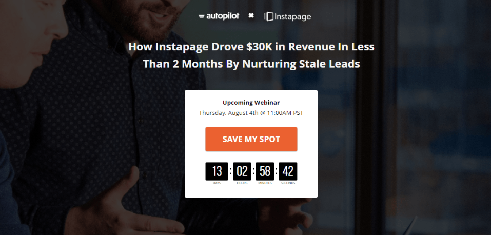
6. Never stop testing
The key to success is to keep testing what works and making sure your landing page provides the best user experiences.
Unsure what your landing page looks like on mobile? Google’s Search Console allows you to check the indexing status of your website and make optimisations. Just enter your URL for an overview of how your landing page is doing – as well as specific areas where you need to improve.
The Speed and Usability sections also highlight metrics such as your impressions, so you can see whether or not certain changes have made an impact.
Not seeing great results? Chop and change standout elements such as your headline or CTA buttons.
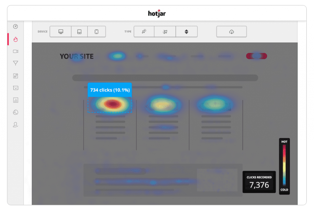
Behaviour analytics tools like Hotjar will uncover user insights and help to assess whether your improvements are working, showing exactly which areas of your site are the most popular.
Read: 10 Free CRO Tools To Use In 2020
Tools and services to help you optimise
There are also many free and cost-effective resources online that can help you create a successful landing page. Even better, some can be used together to drive excellent results and automate your workload.
Here are some of our favourites:
- Landingi – design and publish your landing pages with their easy landing page design platform. They also offer over 300 templates to choose from, so you will certainly find the right one for your business.
- Unbounce – create and optimize dedicated landing pages that prompt your visitors with one focused goal, instead of leaving them to wander a site full of distractions with Unbounce.
- Landing Page Guys – Landing Page Guys are renowned for creating high converting landing pages and websites with 87% of their clients seeing their conversion rates increase.
- Instapage – consisting of six products under one advanced platform, Instapage can help you increase your conversion rates through creating landing pages, personalization, experimentation, AdMap, collaboration and page speed.
- Wishpond – Wishpond gives you everything you need to grow your business under one platform, specialising in creating high, converting landing pages with their easy drag-and-drop builder.
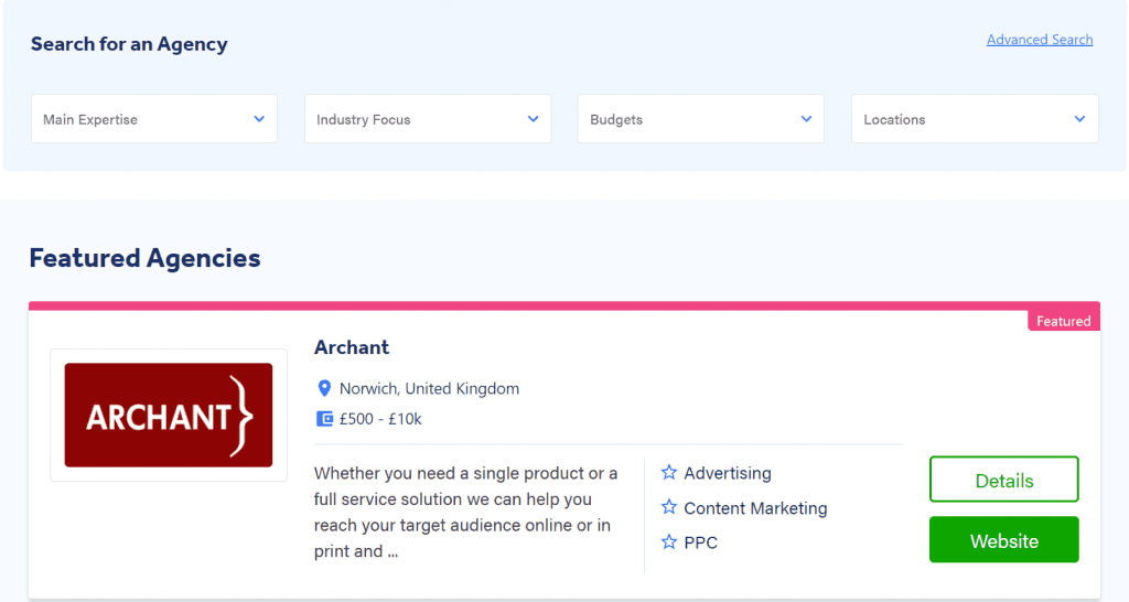
Want to browse leading agencies all in one place? We’ve got the solution.
We recently launched Adzooma Marketplace, a place that puts you in touch with expert digital marketing agencies specialising in areas including:
They’re agencies that thrive on helping businesses like yours. If an agency stands out to you, you can explore your options even further by quickly clicking through to their website. Being able to find innovative features this fast makes scaling your business easier than ever before.
Grow your business today with Adzooma Marketplace.
Follow our tips for unrivalled success
If you want to increase your conversions, you need to make people believe your product is the best out there. That service you’re offering? Tell them how much time it will save. Emphasise that it will speed up their morning routine by 25% and you have 12 case studies to prove it.
Next up, spend some time optimising for mobile to ensure you’re always providing great user experience. The smallest things will help to convert your visitors into customers – including positive testimonials and bold CTA’s.
Build trust, keep your users engaged, and take inspiration from other inspiring landing pages, and you’ll be on your way to a high-converting website in no time at all.

